Introduction
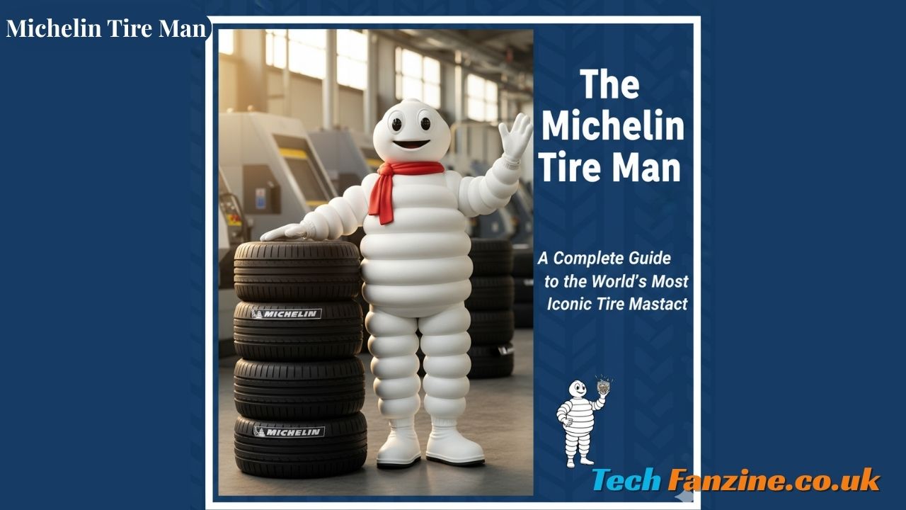
The Michelin tire man stands as one of the most recognizable brand mascots in the world. Known officially as Bibendum, this puffy white character has represented the Michelin brand for over 125 years, making him one of the oldest continuously used corporate symbols in existence. Whether you call him the Michelin Man tires mascot or recognize those distinctive white rolls, this character has become synonymous with quality and reliability in the automotive world.
The michelin tires man has transcended his original purpose as a simple advertising figure to become a cultural icon recognized across continents. His friendly appearance graces everything from tire shops to racing events, and his image has been adapted countless times to fit changing tastes and cultural sensibilities. This article explores the rich history, evolution, and enduring appeal of this remarkable character who has become inseparable from one of the world’s leading tire manufacturers.
Origins and Creation (1894-1898)

The 1894 Lyon Exhibition: A Moment of Inspiration
The story of the tire man Michelin begins at the 1894 Lyon Universal Exhibition in France. André Michelin, one of the two brothers who founded the Michelin company, was walking through the exhibition when something caught his eye. A pile of tires stacked together on display created an unusual silhouette that sparked his imagination. The cylindrical shapes, stacked one atop another, resembled a human figure. André turned to his brother Édouard and remarked that if the stack had arms, it would look like a man.
The Michelin Brothers’ Vision
Édouard and André Michelin were innovators in the tire industry, having already made significant contributions to the development of removable pneumatic tires for bicycles and automobiles. They understood the power of branding and marketing in an increasingly competitive marketplace. The brothers envisioned a mascot that would embody the strength and durability of their products while also being memorable and distinctive.
The Michelin brothers wanted their mascot to communicate that their tires could withstand any road condition, absorb obstacles, and provide superior performance. They needed an artist who could bring their vision to life in a way that would capture the public’s imagination.
Artist Marius Rossillon Brings Bibendum to Life
In 1898, the Michelin brothers commissioned French poster artist Marius Rossillon, who worked under the pseudonym O’Galop, to create their mascot. O’Galop was known for his bold, eye-catching advertising illustrations that were popular in the Belle Époque period. He took the concept of the stacked tires and transformed it into a character that would become legendary.
O’Galop’s original design depicted a rotund figure made entirely of white tires, holding a champagne glass filled with nails, broken glass, and other road debris. This powerful image conveyed the message that Michelin tires could “drink up” obstacles that would destroy lesser tires.
The Latin Slogan “Nunc Est Bibendum”
The name and tagline came from a Latin phrase: “Nunc est bibendum,” which translates to “Now is the time to drink.” This phrase was borrowed from an ode by the Roman poet Horace. In O’Galop’s original poster, the Michelin Man tire character raised his glass in a toast, with the slogan suggesting that Michelin tires would “drink” or absorb all obstacles in their path.
The Latin phrase was sophisticated and memorable, lending an air of European elegance to the marketing campaign. It also cleverly played on the drinking metaphor while establishing the character’s name: Bibendum, derived from the Latin verb “bibere” (to drink).
First Appearance in Advertising Posters
The first official appearance of Bibendum was in a poster created for the 1898 Paris Salon, a crucial automotive exhibition. The poster showed the corpulent white figure holding his famous glass and declaring his ability to overcome road hazards. The image was striking, unusual, and immediately memorable.
The early advertising posters were placed in strategic locations throughout French cities and at automotive events. The response was overwhelmingly positive. People were fascinated by this unusual character who represented both the strength of the product and a friendly, almost jovial personality.
The Name and Identity

Why “Bibendum” – The Official Name
While many people know him as the Michelin Man, the character’s official name has always been Bibendum. This name comes directly from the Latin advertising slogan and has remained consistent throughout the mascot’s long history. In Michelin’s corporate communications and official materials, Bibendum is the preferred name, though the company acknowledges that most people use more casual nicknames.
The name Bibendum reflects the original concept of a character who “drinks up” road obstacles, consuming nails, glass, and debris that would puncture inferior tires. This clever wordplay established the mascot’s identity as both sophisticated and functional—a character with purpose beyond mere entertainment.
Popular Nicknames: Mr. Bib and Others
Over the decades, people around the world have created various nicknames for the character. In English-speaking countries, he’s most commonly called the Michelin Man. In France, people affectionately refer to him as “Bibendum” or sometimes “Bib.” British audiences often call him “Mr. Bib,” adding a touch of formal friendliness to the nickname.
Different cultures have developed their own names for the character. In some countries, children call him “the tire man” or “the white man.” These various nicknames demonstrate how the character has been embraced by different cultures while maintaining his essential identity.
Original Design vs. Modern Appearance
The original Bibendum looked quite different from today’s version. In O’Galop’s early illustrations, the character appeared more imposing and less approachable. He was composed of many more tire rings, creating a bulkier, more intimidating figure. Early Bibendum often appeared with accessories like cigars, champagne glasses, and pince-nez spectacles, giving him an aristocratic air that reflected Belle Époque sensibilities.
The modern version of the mascot has been streamlined considerably. Today’s Bibendum has fewer tire segments, creating a leaner, more athletic appearance. His face is simpler and more friendly, with larger eyes that convey warmth and approachability. The removal of the cigar and alcohol associations reflects changing social attitudes and makes the character more family-friendly.
Evolution from Menacing to Friendly Character
Early depictions of Bibendum sometimes portrayed him as almost threatening—an influential figure who dominated the road and crushed obstacles beneath him. Some posters showed him boxing with competitors or aggressively demonstrating Michelin’s superiority. This aggressive marketing style was typical in the late 19th and early 20th centuries.
As decades passed, the character softened considerably. The emphasis shifted from dominance to helpfulness, from aggression to reliability. Modern Bibendum is portrayed as a friendly companion to drivers, a reassuring presence that represents safety and quality rather than brute force. This evolution reflects broader changes in marketing approaches and cultural values.
Design Evolution Through the Decades

1890s-1900s: The Cigar-Smoking, Glass-Raising Original
The earliest version of the mascot was decidedly adult-oriented. Bibendum appeared in advertisements smoking cigars, drinking champagne, and engaging in activities associated with wealthy European gentlemen. His body consisted of numerous narrow tire bands, giving him a lumpy, segmented appearance that emphasized the tire construction.
The color palette in these early years was limited by printing technology. Most advertisements appeared in sepia tones, blacks, and whites, with occasional color highlights. The character often appeared in dynamic poses—racing automobiles, challenging competitors, or demonstrating the strength of Michelin products.
1910s-1930s: Athletic and Adventurous Portrayals
As automobile culture expanded and racing became popular, Bibendum took on a more athletic character. Advertisements from this period showed him participating in races, performing acrobatic feats, and engaging in adventurous activities. The mascot appeared with early racing cars, motorcycles, and even airplanes as Michelin expanded into aviation tires.
During this period, the character began appearing in three-dimensional form at exhibitions and automotive shows. These early sculptures and costumes helped bring Bibendum to life in ways that flat posters couldn’t achieve. The physical presence made the mascot more tangible and memorable for audiences.
1940s-1960s: Streamlining and Simplification
Post-World War II design aesthetics favored simplicity and modernism. Bibendum underwent significant streamlining during these decades. The number of tire segments was reduced, creating a cleaner, more recognizable silhouette. The accessories that had defined early versions—cigars, glasses, formal wear—began disappearing from most representations.
The color scheme became more standardized during this period. While Bibendum remained predominantly white, the specific shade and texture were refined to reproduce consistently across different media. Blue became the standard background color in many advertisements, creating a strong contrast and making the character immediately recognizable.
1970s-1990s: Color Television Era Adaptations
The rise of color television advertising presented new opportunities and challenges. Bibendum needed to work effectively in motion and in full color. Animators developed ways to make the character move naturally despite his unusual body structure. Television commercials showed him rolling, bouncing, and interacting with real people and vehicles.
During these decades, regional variations became more common as Michelin adapted its character for different markets. While the basic design remained consistent, specific campaigns in other countries might show Bibendum in locally relevant situations or with cultural adaptations.
2000-Present: Modern, Slimmer, More Approachable Design
The 21st century brought the most significant redesign in Bibendum’s history. In 2000, Michelin unveiled a dramatically updated version with fewer tire rings, a more athletic build, and a friendlier face. The new design better reflected modern tire technology and contemporary design aesthetics.
The modern mascot has been optimized for digital media. His simplified form works well at small sizes on websites and mobile devices. Three-dimensional computer modeling has created sophisticated versions of the character for video games, animated commercials, and augmented reality applications. Despite these technical updates, the essential character remains recognizable as the exact figure who first appeared in 1898.
Cultural Impact and Recognition
Global Brand Awareness and Recognition Rates
Studies consistently show that Bibendum ranks among the most recognized brand mascots worldwide. In some markets, recognition rates exceed 90%, placing the character alongside other iconic symbols like the McDonald’s golden arches or the Coca-Cola script. This remarkable awareness spans age groups, cultures, and geographic regions.
The mascot’s recognition transcends the automotive industry. Many people who aren’t particularly interested in cars or tires still recognize the character and associate it with quality and reliability. This broad cultural penetration represents a marketing achievement few brands can match.
Appearances in Popular Culture
The character has appeared in numerous films, television shows, and other media over the decades. Sometimes these appearances are official partnerships; other times, the character appears as a cultural reference or visual shorthand for tire-related themes. Directors and artists recognize that audiences will immediately understand what the character represents.
Artists have incorporated the mascot into various works, from Pop Art pieces to contemporary installations. The character’s distinctive appearance and cultural significance make him an intriguing subject for artistic interpretation. Some of these works celebrate the mascot, while others offer commentary on corporate branding and consumerism.
Merchandising and Collectibles
Michelin has produced extensive merchandise featuring Bibendum over the years. Collectors seek vintage advertising posters, which can command high prices at auction. Other collectibles include figurines, keychains, clothing, and decorative items. Some of the earliest items, particularly posters by O’Gallop, are considered valuable pieces of advertising art history.
The company has embraced this collector enthusiasm, occasionally releasing special edition items and commemorative pieces. Vintage Michelin Man items appear regularly in antique shops, online marketplaces, and specialized auctions focused on automotive memorabilia.
Trademark and Intellectual Property Status
Michelin vigorously protects its mascot through trademark and intellectual property law. The character’s distinctive appearance is protected in jurisdictions worldwide. The company monitors unauthorized uses and takes action when necessary to prevent dilution of the brand or inappropriate associations.
This protection extends to derivative works, parodies, and similar characters that might confuse. While Michelin generally allows artistic and editorial uses, commercial exploitation without permission is actively challenged. This vigilant protection has helped maintain the character’s integrity and brand value over more than a century.
Marketing and Advertising Campaigns
Historic Advertising Strategies
From the beginning, Michelin used innovative advertising strategies centered around their mascot. Early campaigns focused on print posters displayed at strategic locations—train stations, racing venues, and automotive exhibitions. These posters combined striking visuals with clever copy that emphasized product benefits.
The company pioneered the use of mascots in sustained marketing campaigns. Rather than treating Bibendum as a one-time gimmick, Michelin developed the character’s personality and story across multiple advertisements over many years. This consistency helped build strong brand associations.
Memorable Campaigns Featuring Bibendum
Throughout the decades, specific campaigns have stood out for their creativity and effectiveness. Racing-themed advertisements capitalized on Michelin’s involvement in motorsports. Safety-focused campaigns portrayed the mascot protecting families and children. Technological innovations were illustrated through imaginative scenarios showing the character interacting with new products.
One particularly successful approach involved showing Bibendum in everyday situations that drivers could relate to—navigating bad weather, dealing with rough roads, or embarking on family road trips. These campaigns made the mascot feel relevant and helpful rather than distant or purely commercial.
Social Media Presence and Digital Marketing
In the digital age, Bibendum has successfully transitioned to social media platforms. Official Michelin accounts feature the character in posts, videos, and interactive content. The mascot’s visual appeal translates well to Instagram, where his distinctive appearance stands out in feeds. Animated GIFs and short videos bring him to life for younger audiences.
Digital marketing campaigns have explored new possibilities for character interaction. Augmented reality experiences allow users to see Bibendum in their physical environment through smartphone cameras. Interactive games and apps feature the mascot in various roles, introducing him to new generations of potential customers.
International Variations and Adaptations
While the basic character remains consistent worldwide, Michelin adapts specific campaigns for different markets. In some regions, advertisements emphasize features most relevant to local conditions—extreme temperatures, rough terrain, or specific driving challenges. The mascot might appear in culturally appropriate settings or engage in locally popular activities.
Language variations extend beyond simple translation. The tone and messaging of campaigns are carefully adapted to resonate with different cultural values and communication styles. Despite these variations, the character remains instantly recognizable as the same beloved mascot.
Connection to Michelin’s Brand Values
How Bibendum Represents Safety and Reliability
The mascot embodies Michelin’s commitment to safety above all else. Modern campaigns consistently show Bibendum protecting vehicles and their occupants, reinforcing the message that Michelin tires provide superior protection. The character’s solid, dependable appearance visually communicates reliability and trustworthiness.
Safety messaging often features families and children, with the mascot portrayed as a guardian figure. This emotional approach connects product features—better traction, shorter stopping distances, improved durability—with the human consequences of tire performance. The character makes these technical benefits feel personal and essential
Association with the Michelin Guide
Interestingly, Bibendum also appears in materials related to the famous Michelin Restaurant guides. This connection between tires and fine dining might seem odd, but it reflects Michelin’s broader commitment to quality experiences. The same company that ensures safe travels also guides travelers to excellent dining establishments.
The Michelin star system for rating restaurants is one of the most prestigious culinary honors worldwide. While the mascot is less prominently featured in guide materials than in tire advertising, the connection reinforces Michelin’s reputation for expertise, quality standards, and attention to detail across different domains.
Innovation and Technology Messaging
As tire technology advances, the mascot helps communicate complex innovations in accessible ways. Advertisements might show Bibendum demonstrating new tire compounds, tread patterns, or construction techniques. The character makes technical information more engaging and easier to understand for general audiences.
Electric vehicle tires, run-flat technology, and eco-friendly materials all get the Bibendum treatment in modern campaigns. The mascot bridges the gap between engineering achievements and consumer benefits, translating technical specifications into real-world advantages that drivers can appreciate.
Environmental and Sustainability Initiatives
Michelin has increasingly focused on environmental sustainability, and the mascot plays a role in these communications. Campaigns highlight fuel-efficient tires that reduce carbon emissions, recycling programs, and sustainable manufacturing practices. Bibendum appears in green settings, protecting nature and promoting responsible stewardship.
These environmental messages align with changing consumer values and regulatory pressures. The mascot’s long history and trusted image help convey that Michelin’s sustainability efforts are genuine and substantive rather than superficial “greenwashing.” The character’s evolution mirrors the company’s evolution toward greater environmental responsibility.
Controversies and Criticisms
Early Racially Insensitive Depictions
Like many early advertising characters, Bibendum appeared in some materials that would be considered unacceptable by modern standards. Certain early 20th-century advertisements featured imagery and comparisons that reflected the prejudices of their time. Some posters showed the character in scenarios that perpetuated racial stereotypes or made insensitive comparisons.
These historical materials present a complex challenge. They are part of the character’s history and the broader history of advertising, but they also represent attitudes and approaches that are rightly condemned today. Scholars and critics have documented these problematic materials as examples of how advertising reflected and reinforced social prejudices.
Modern Rebranding Efforts to Address Concerns
Michelin has acknowledged these problematic historical materials and has worked to ensure modern representations are inclusive and respectful. The company has deliberately shaped Bibendum’s contemporary image to be welcoming to all people regardless of background. Modern campaigns feature diverse casts of characters and avoid any imagery that could be interpreted as exclusionary or insensitive.
The company has also supported educational efforts that contextualize historical advertising materials, helping people understand how cultural values and marketing approaches have evolved. This transparent approach acknowledges past mistakes while demonstrating commitment to current values.
Cultural Sensitivity in Global Markets
Operating in dozens of countries requires careful attention to cultural differences and sensitivities. Michelin works with local marketing teams to ensure campaigns featuring Bibendum are appropriate for each market. What works in one culture might be misunderstood or offensive in another.
The character’s relative simplicity—a human-like figure made of tires—actually helps in this regard. Unlike mascots with specific ethnic or cultural characteristics, Bibendum can be positioned as universal. This flexibility has contributed to his success across diverse global markets.
The Michelin Man Today
Current Role in Marketing Strategy
Despite being over 125 years old, the mascot remains central to Michelin’s marketing strategy. He appears in most major advertising campaigns, social media content, and brand communications. Market research shows that the character continues to drive positive brand associations and helps Michelin maintain its premium market position.
The company balances tradition with innovation in how it deploys the mascot. Traditional media like television and print still feature Bibendum, but digital channels increasingly dominate the marketing mix. The character successfully bridges these different media, maintaining relevance across generational divides.
Physical Presence: Statues, Events, and Mascot Appearances
Large Bibendum statues appear at Michelin facilities, tire shops, and special events worldwide. These physical installations create memorable photo opportunities and reinforce brand presence in the physical world. Some statues have become local landmarks, attracting tourists and tire enthusiasts.
Costumed performers wearing Bibendum suits appear at racing events, automotive shows, and community gatherings. These appearances allow people to interact directly with the character, creating personal connections that strengthen brand loyalty. Children especially enjoy meeting the friendly mascot in person.
Digital and Virtual Representations
The digital realm offers exciting new possibilities for the character. Video game appearances, virtual reality experiences, and augmented reality applications bring Bibendum to life in interactive ways previous generations couldn’t imagine. These technologies allow for storytelling and engagement that static media cannot achieve.
Mobile apps featuring the mascot help users find tire dealers, check tire pressure, access maintenance information, and even play games. These functional and entertaining applications keep the character relevant in daily life while providing valuable services to Michelin customers.
Future of the Brand Mascot
As marketing continues evolving, Bibendum will undoubtedly grow as well. Future developments might include artificial intelligence-powered interactions, holographic appearances, or integration with autonomous vehicle systems. The character’s fundamental appeal—friendly, helpful, reliable—should translate well to whatever media platforms emerge.
Michelin has demonstrated remarkable skill in updating the mascot while preserving its essential character. This balance between tradition and innovation suggests Bibendum will remain relevant for decades to come. New generations will discover him through media their grandparents couldn’t imagine, but they’ll recognize the exact friendly figure who first appeared in 1898.
Conclusion
The Michelin Man tire character represents one of the most successful branding achievements in history. From his origin at the 1894 Lyon Exhibition through his evolution into a global icon, Bibendum has remained relevant through massive technological, social, and cultural changes. Few brand mascots have demonstrated such longevity while maintaining such high recognition and positive associations.
What explains this remarkable success? The character’s visual distinctiveness certainly helps—there’s nothing else quite like a man made of tires. The consistent use over more than a century has built familiarity across multiple generations. The continuous evolution and adaptation kept the mascot from becoming dated or irrelevant.
Most importantly, Bibendum successfully embodies the values that Michelin wants customers to associate with their products: safety, reliability, quality, and innovation. The character isn’t just decoration; he’s the personification of brand promises. When people see the mascot, they don’t just think of tires—they think of protection, dependability, and excellence.
As we look toward the future, the legacy of this beloved character seems secure. New technologies and changing consumer behaviors will certainly require adaptations, but Michelin has proven adept at evolving the mascot while maintaining its essential appeal. Whether appearing in traditional media or emerging digital platforms, Bibendum continues connecting with audiences and reinforcing one of the world’s most valuable brands.
The story of the Michelin Tire Man reminds us that effective branding creates emotional connections that transcend mere product features. Bibendum isn’t just a marketing tool—he’s a friend who’s been accompanying travelers on their journeys for over 125 years, and that relationship shows no signs of ending anytime soon.
Also Read: GSF Car Parts Your Complete Guide to Quality Automotive Components